Primary Logo
Wordmark
Purpose
The purpose of Dryve is to revolutionize the way NFL fans consume sports content. By delivering fast, reliable, and fan-focused coverage, the platform aims to make football news accessible, engaging, and enjoyable for all.
Whether it's breaking news, player analysis, or interactive fan polls, every piece of content is crafted to inform, entertain, and spark conversation. The Dryve seeks to build a loyal community of football enthusiasts who feel connected, valued, and consistently engaged.
Identity
The Dryve is a community-driven experience for NFL fans. With a voice that's conversational, energetic, and sometimes playful, the brand operates like a passionate friend who always has the inside scoop. The platform embraces innovation and fan participation, encouraging users to be part of the story.
Through a mix of humor, authenticity, and expertise, The Dryve positions itself as the essential stop for NFL news, analysis, and entertainment. Its identity is rooted in transparency, quality, and a commitment to keeping fans at the heart of the experience.
Typefaces
The Dryve utilizes a bold and modern typographic style to establish a strong visual identity. For headlines, the brand employs Tusker Grotesk 4700 Bold and Tusker Grotesk 5700 Bold, ensuring attention-grabbing section titles and subheadings that create clear hierarchy and emphasis. For body text, United Sans Regular Black and United Sans Extended are used to maintain readability and consistency throughout the document. This combination of fonts strikes a balance between impact and clarity, reinforcing the brand's professional, fan-focused, and forward-thinking aesthetic.
Posts
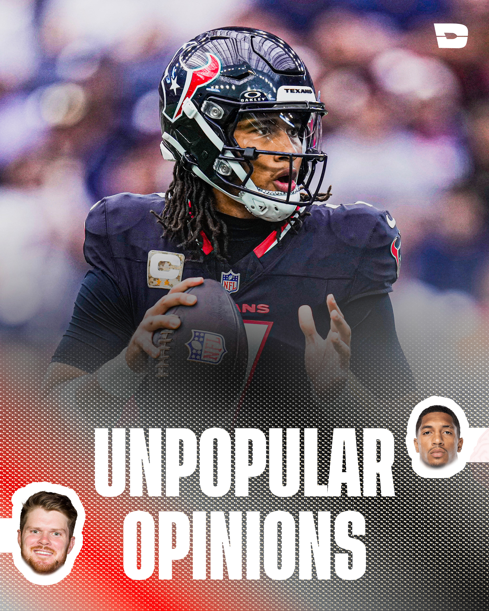
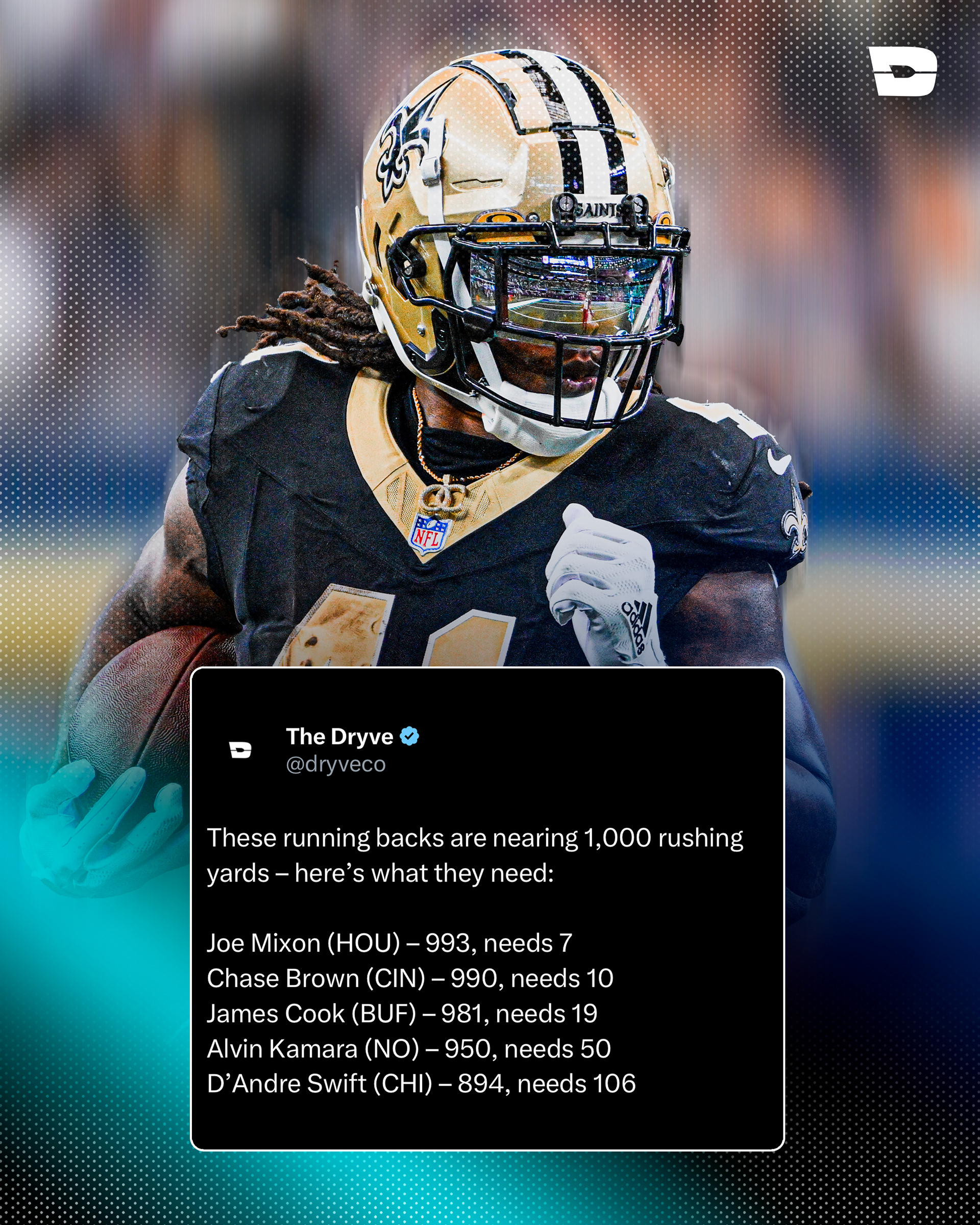
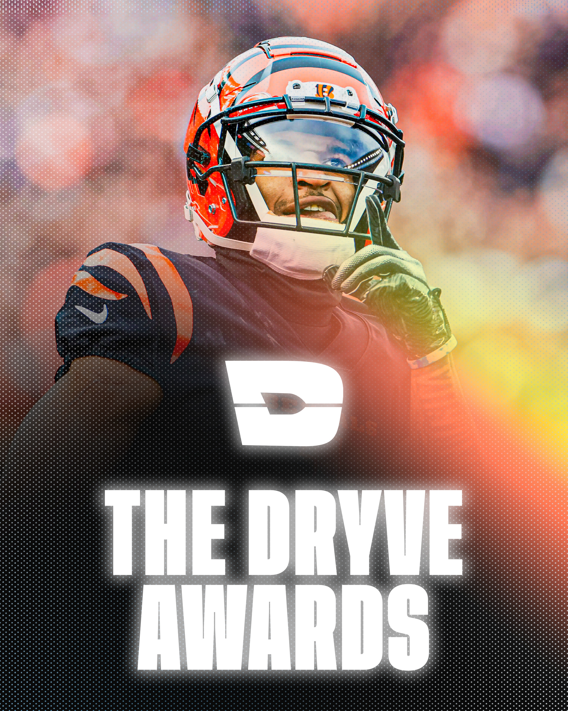
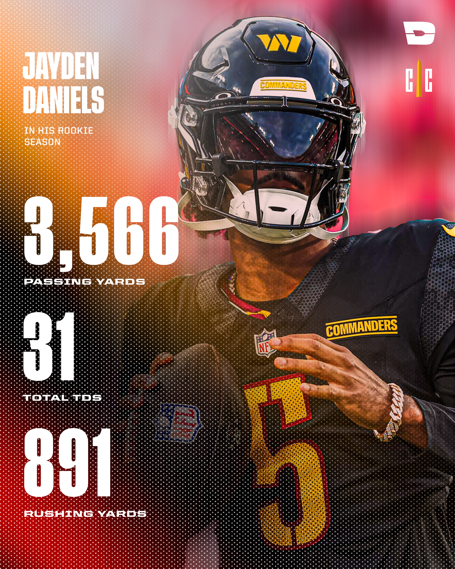
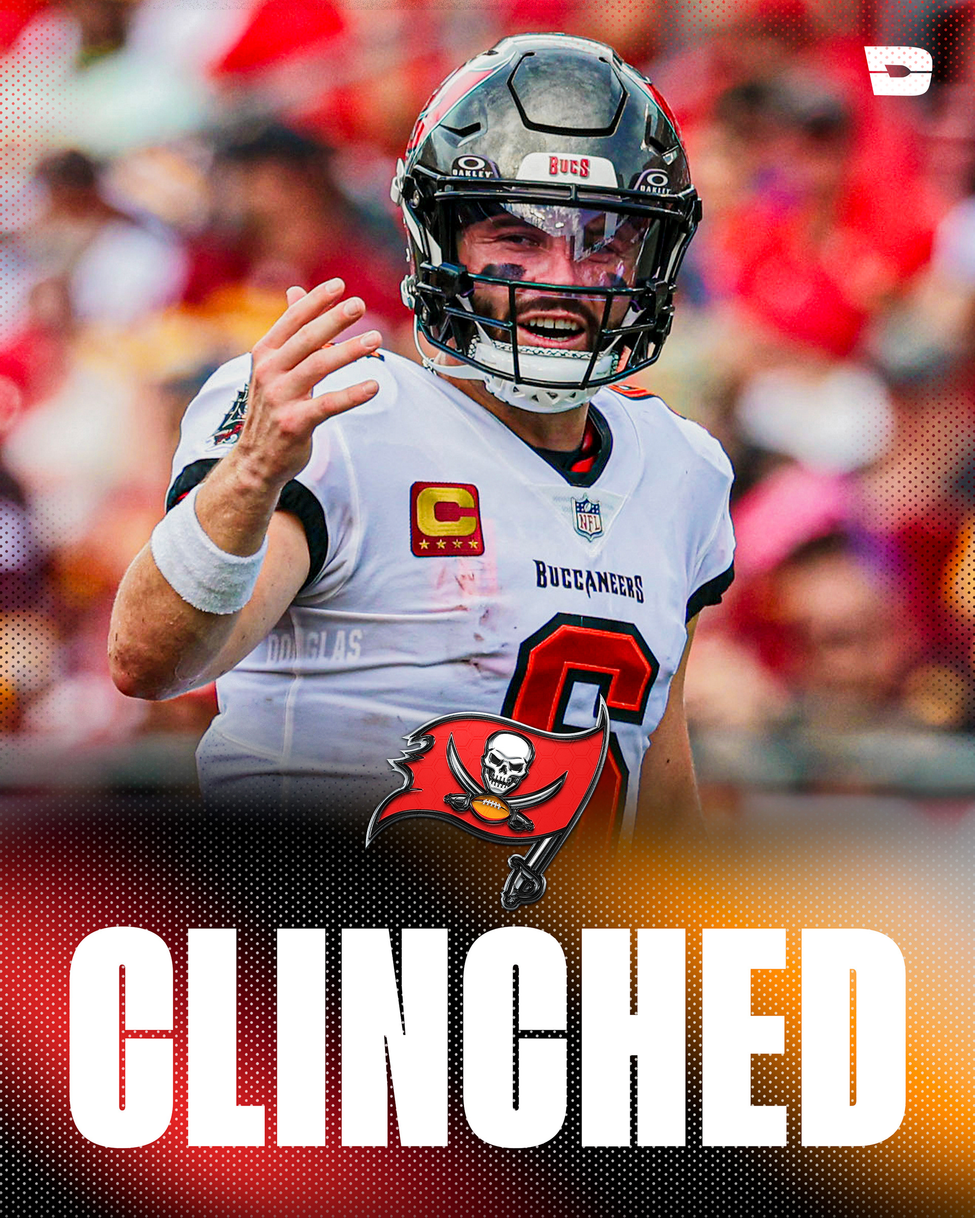
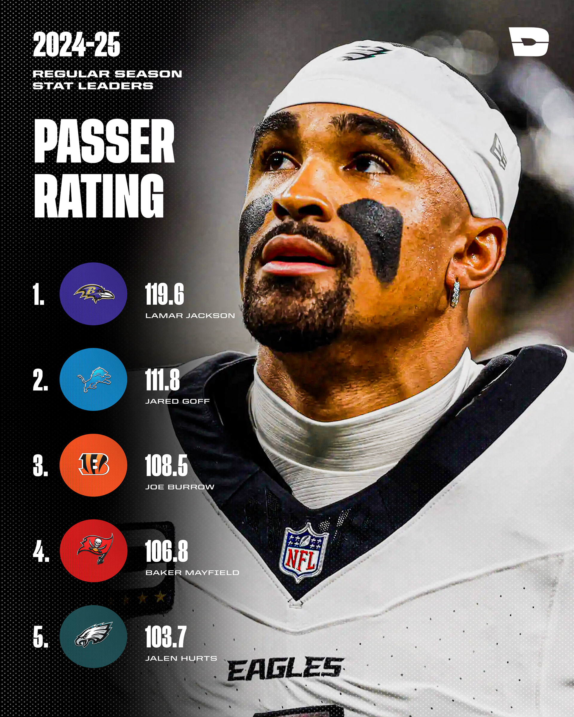
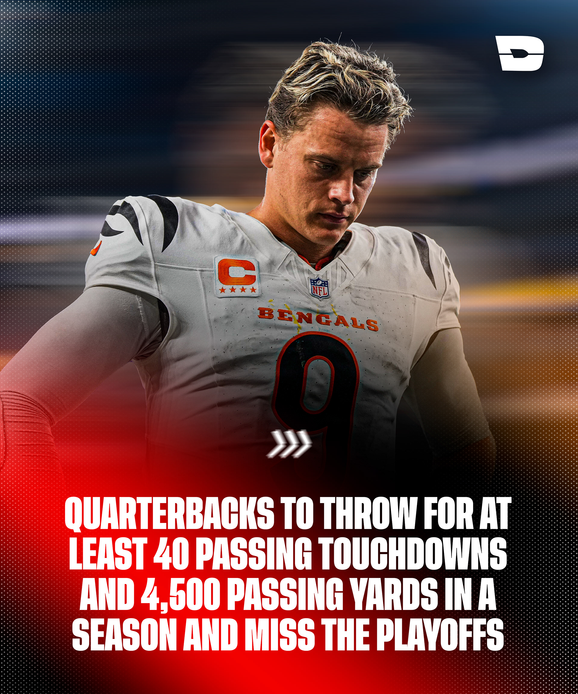
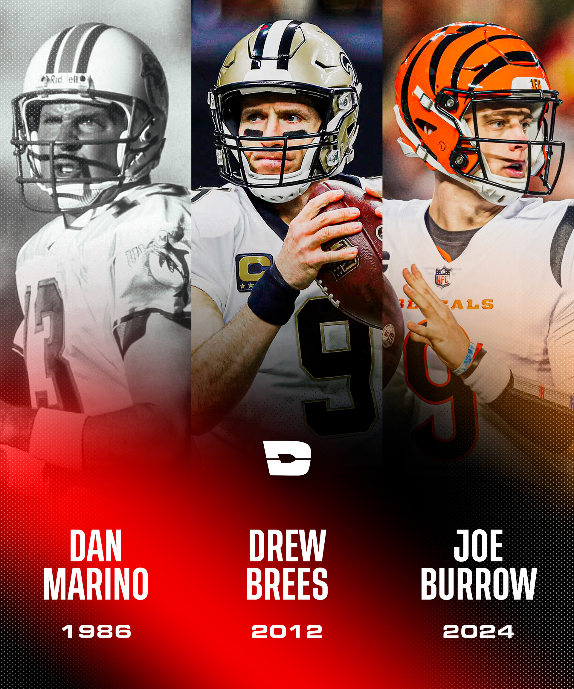
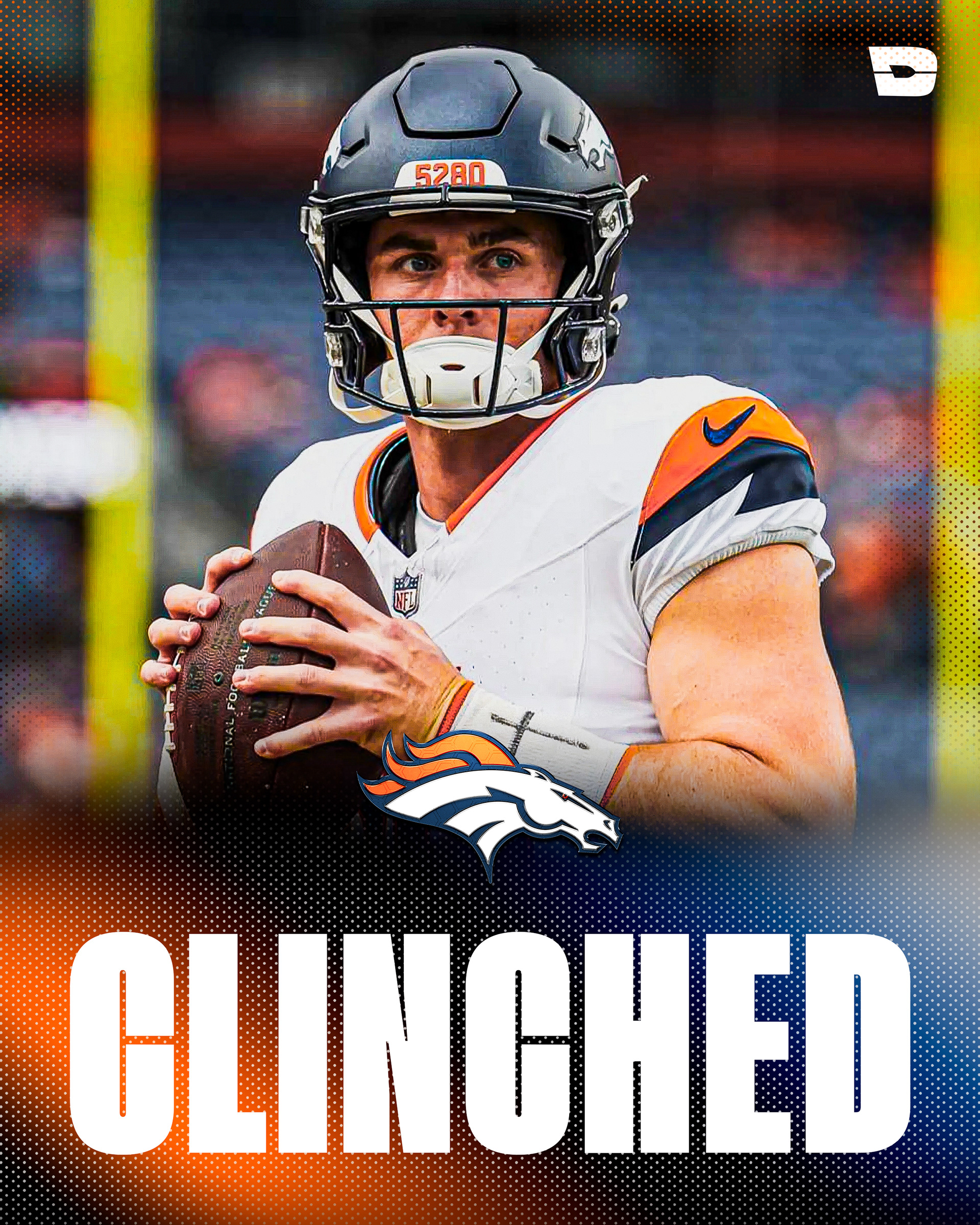
The visual style of The Dryve is designed to captivate and engage audiences at first glance. Each post features a vibrant mix of colorful gradients that create a dynamic, energetic feel reflective of the fast-paced world of NFL content.
These gradients not only add depth and visual appeal but also reinforce the brand's modern, forward-thinking identity. Complementing the gradients is a signature dot texture that provides a subtle yet impactful layer of detail, giving posts a tactile, multimedia-inspired look.
This unique design approach ensures that every post, from highlight clips to player comparisons, stands out on crowded social media feeds, drawing in fans and encouraging interaction. Together, the colorful gradients and dot texture embody the essence of The Drive — bold, fresh, and always in motion.
